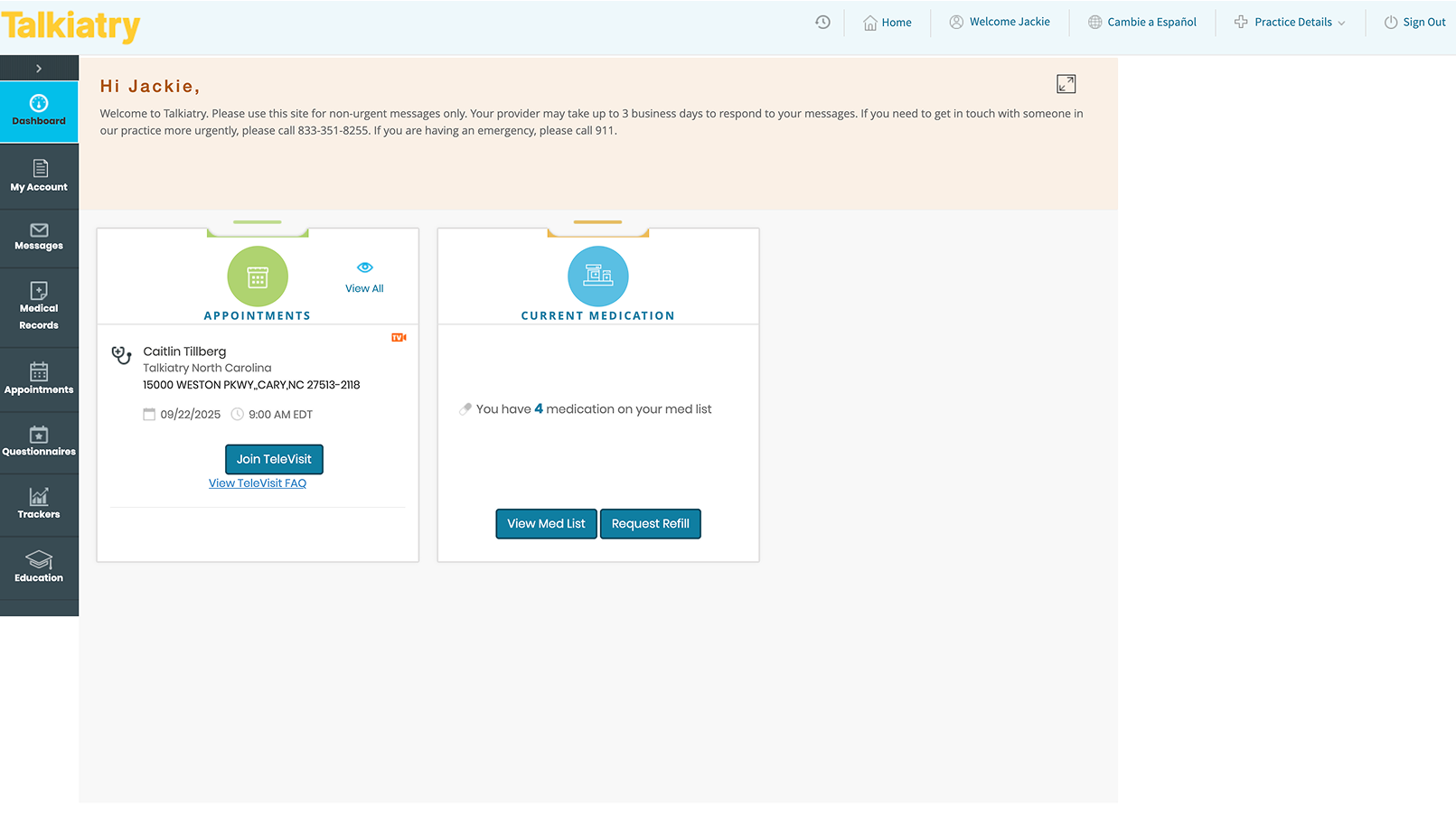
The Challenge
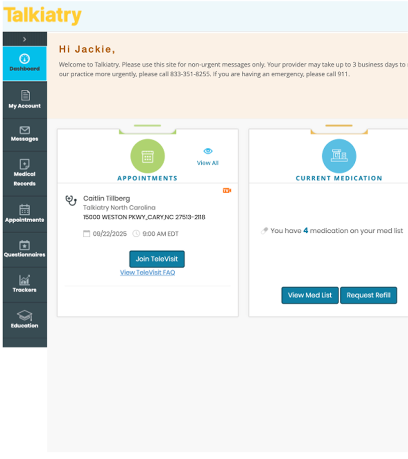
The original Talkiatry dashboard presents essential information, but in a layout that feels clinical, outdated, and impersonal. The heavy side navigation bar and small text hierarchy create cognitive load, and there's little to no visual indication of the patient’s progress or journey. For a mental health platform, the tone and flow of information should feel encouraging, intuitive, and safe.
Goals
- Reduce cognitive overload for new patients.
- Improve clarity and emotional resonance in the dashboard.
- Introduce clearer navigation through a drawer system.
- Make it easier to find a therapist—a key missing function.
Design Decisions
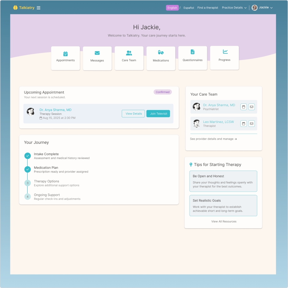
- Soft Wave Background: Introduces calm and visual warmth using lavender and cream tones.
- Top Card Navigation: Replaces sidebar with 6 easy-to-scan primary actions (Appointments, Messages, Care Team, etc.).
- Your Journey Module: Timeline-style visual of where the user is in their care, making the mental health process feel clearer and supported.
- Therapy Tips Section: Adds brief psychoeducational encouragement, fostering emotional support.
- Clean Typography and Layout: Prioritizes readability and intuitive flow.
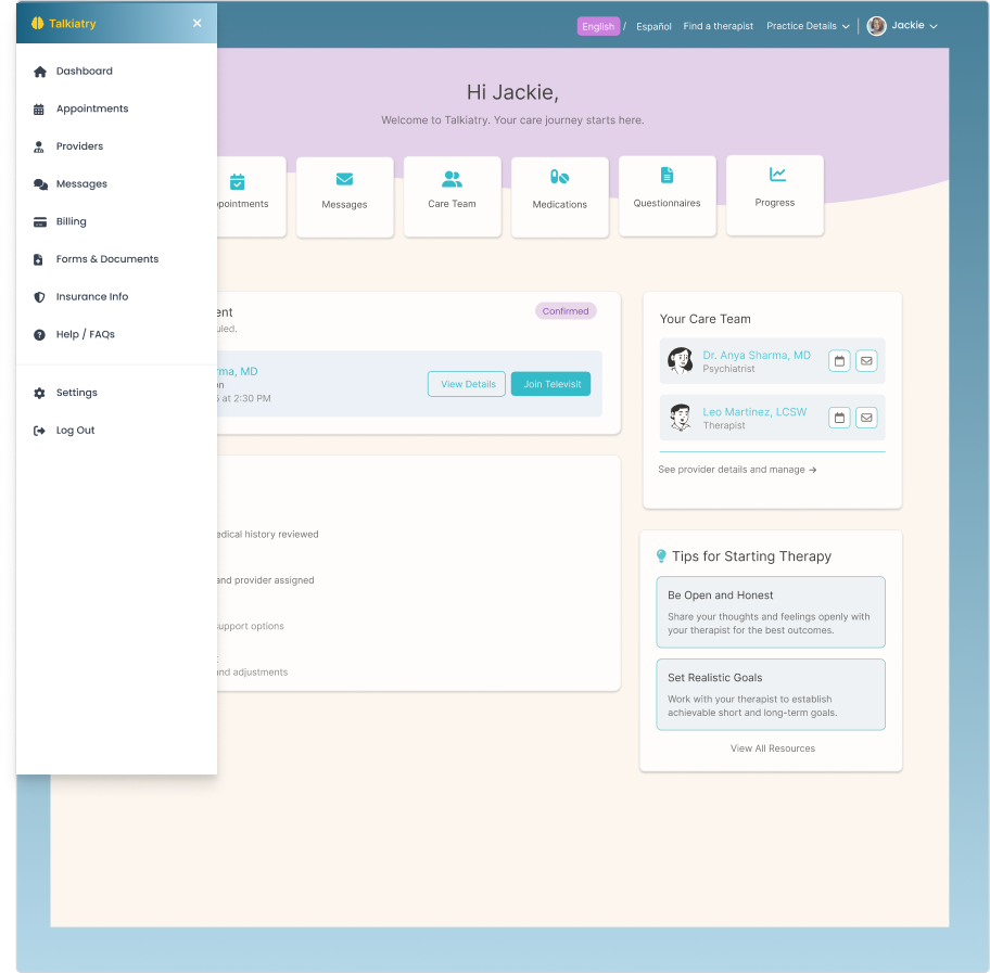
- navigation redesign– Hamburger + Drawer to reduce top-bar clutter: Added Find a therapist as a vital feature
Conclusion
This redesign demonstrates how thoughtful UX can improve patient well-being by reducing friction, increasing clarity, and humanizing healthcare platforms. By prioritizing emotional resonance, the experience becomes more welcoming and easier to navigate, especially for new users in vulnerable moments.
See the App Section