The Challenge
Healthcare dashboards often prioritize data density over emotional connection, leading to interfaces that feel sterile and overwhelming. For patients, especially those managing multiple aspects of their care, the experience should be both clear and reassuring. This project set out to design a healthcare dashboard concept from the ground up, one that balances professionalism with warmth, clarity, and ease of use.
Goals
- Create a welcoming, intuitive entry point for patients managing appointments, messages, lab results, and health summaries.
- Establish a clear, consistent visual hierarchy to improve scan-ability.
- Maintain a professional, trustworthy tone while introducing visual warmth.
- Ensure design scalability across multiple dashboard sections.
Design Decisions
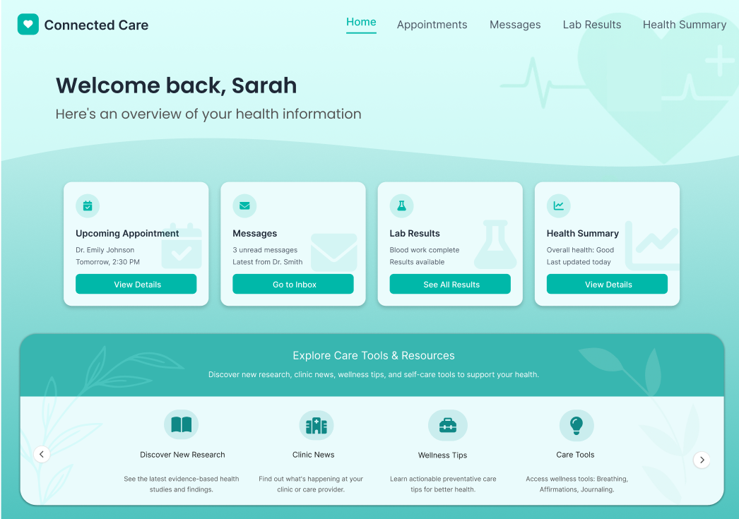
- Gradient Background with Soft Medical Motifs: A calm teal gradient paired with abstract heart, EKG, and plant motifs to signal health, care, and growth.
- Top Card Navigation: Four large, clearly labeled cards for key actions (Appointments, Messages, Lab Results, Health Summary) make essential information immediately accessible.
- Section Spacing & Hierarchy: Distinct separation between primary dashboard cards and the “Explore Care Tools & Resources” section for faster scanning.
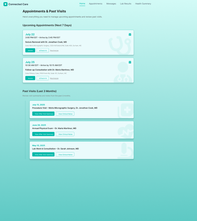
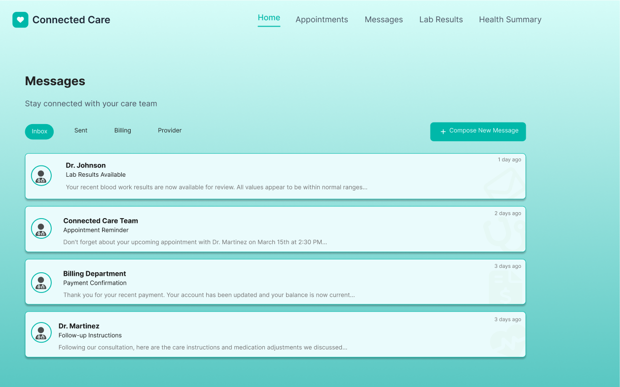
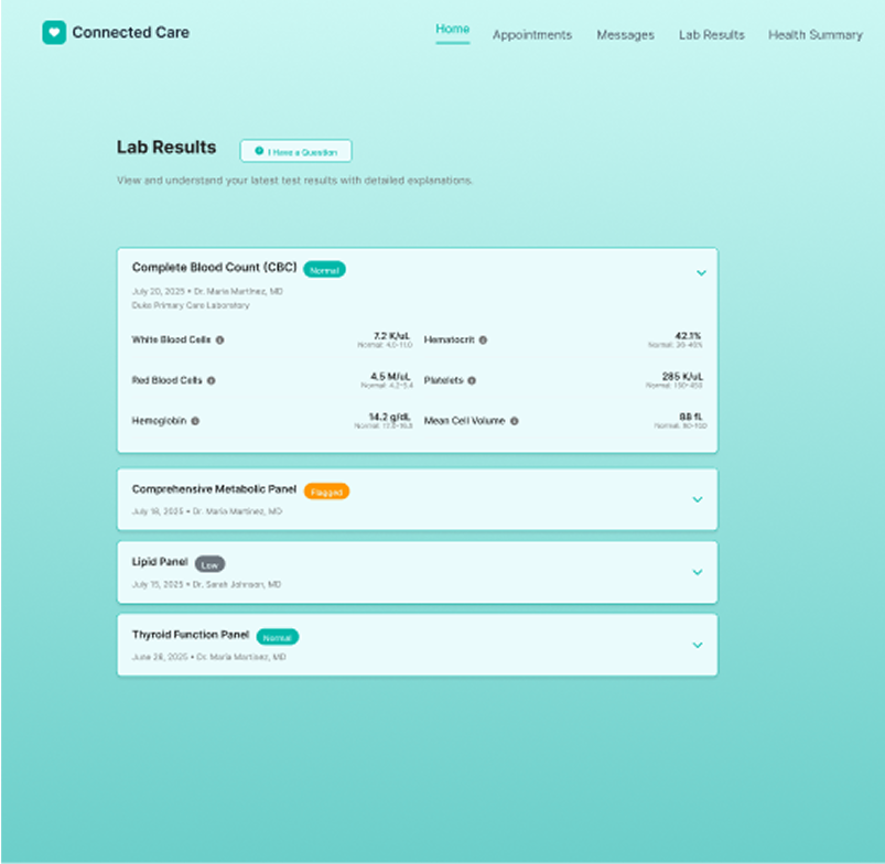
- Consistent Card Styling Across Pages: Same corner radius, shadow depth, and typography applied to all sections (Appointments, Messages, Lab Results).
- Readable Typography: Optimized font sizes and contrast for accessibility without sacrificing aesthetics.
- Unified Iconography: Consistent line-style icons for clarity and visual harmony.
Conclusion
The Connected Care concept demonstrates how healthcare dashboards can be both professional and approachable. By combining warmth, consistent hierarchy, and scalable design patterns, the interface supports quick decision-making while fostering trust and a sense of care. This project showcases the ability to design a complete, patient-focused dashboard experience from the ground up.
See the App Section